analyzing and presenting data
David Hornby
It is good valuation practice to provide a descriptive
analysis of sale
or rental data for inclusion in the valuation report. Basic statistical
analysis used as a descriptive tool is particularly useful in this
regard. This part will cover the use of measures of central tendency
and spread. This will be done by using an example:
EXAMPLE
The following are the
residential sales analyzed in a suburb in which the subject comparable
property is being valued:
SUBURB: Summerton
Number of sales: 19 $'000
250 300 350 350 400
400 400 450 450 450 500 500 600 650 700 750 1000 1200 1500
How should such data
be included in the valuation report?
A very effective method is to summarize it as a frequency
distribution.
The following tables how this is carried out using common spreadsheet
commands:
PREPARING A FREQUENCY
HISTOGRAM IN EXCEL
1. Enter data to be
analyzed
2. Enter bin values:
100 300 500 700 900 1100 1300 1500 1700
<Options><Analysis tools><Histogram>
Enter input range
Enter bin range
Enter output range
<Enter>
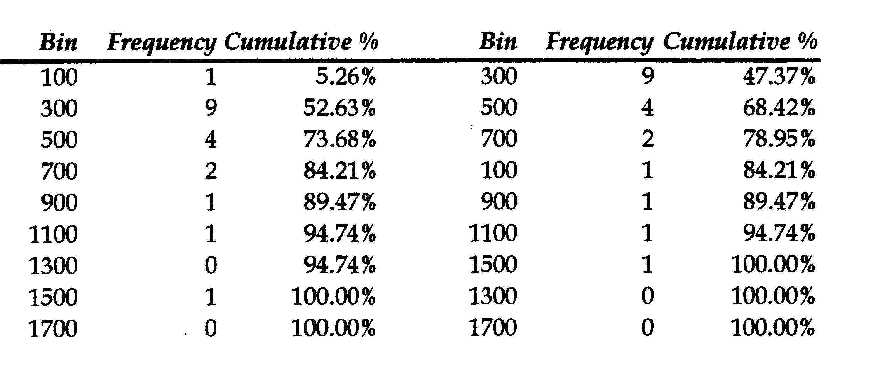
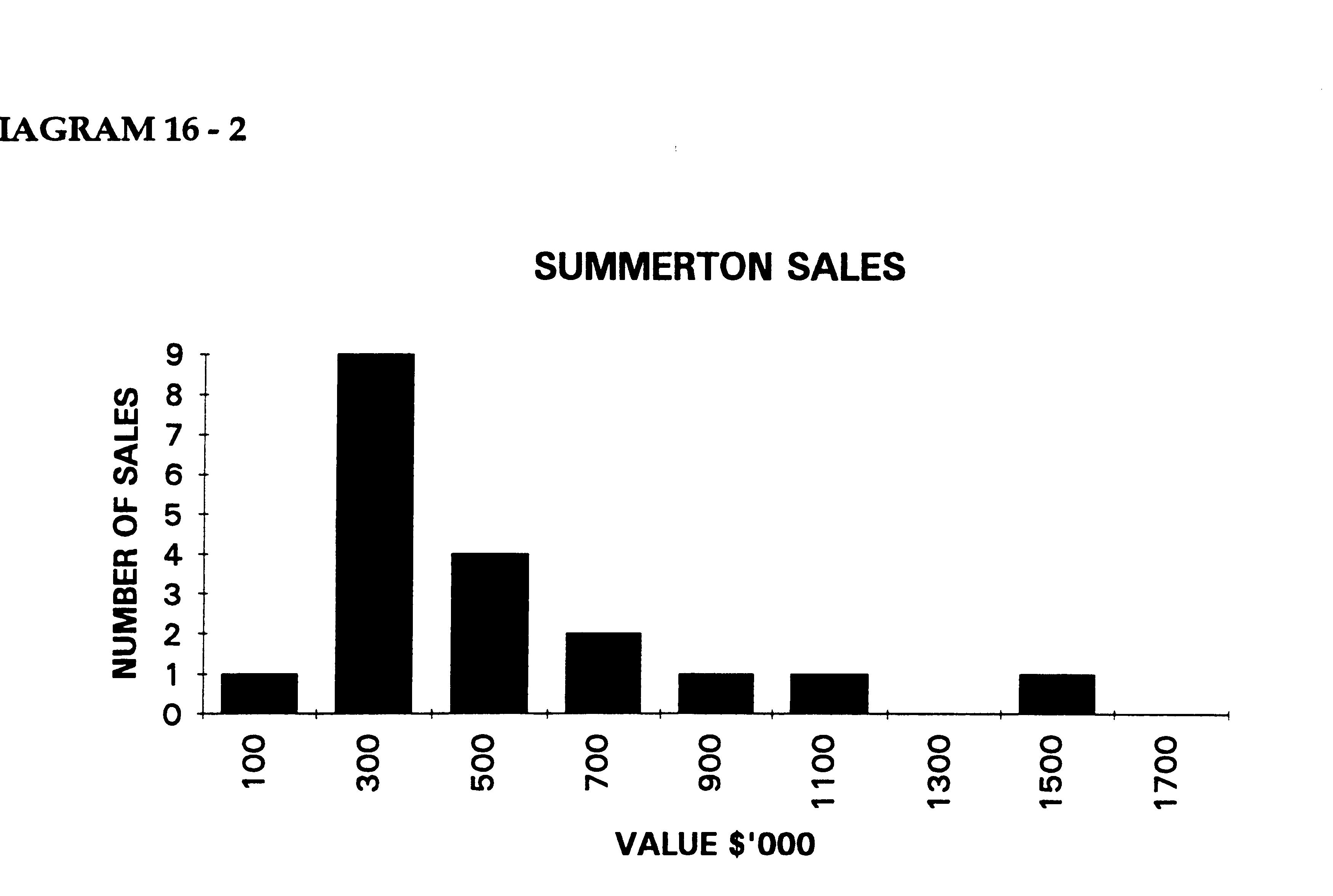
Excel will construct
a table showing the frequency values, cumulative totals and a histogram
as a chart. This is shown below:
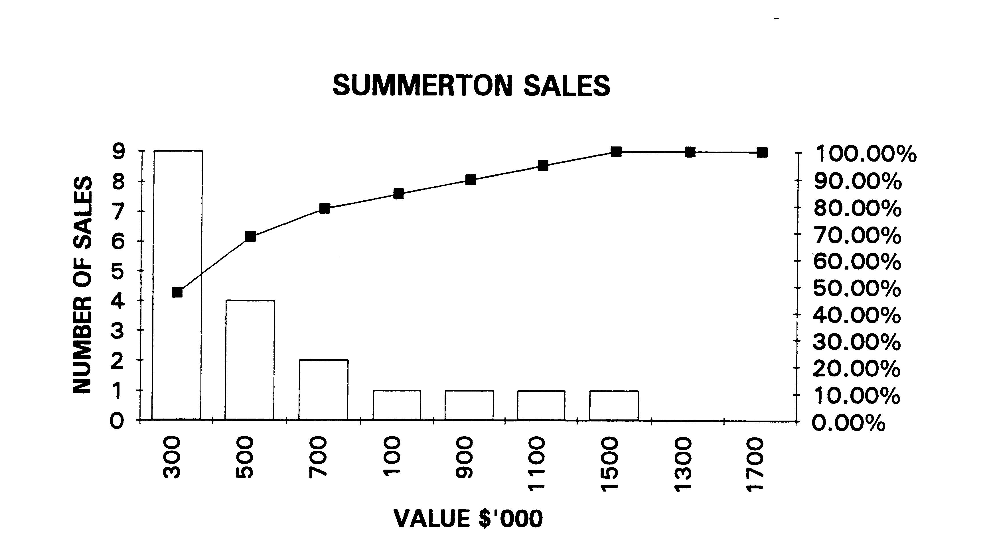
If the pareto chart option is chosen an
additional table will be constructed on the right of the frequency
table. The subsequent pareto chart
is shown below. It is useful in that it shows the progressive
accumulation of sale data from the highest column at the left to the
lowest column at the right.
The distribution
above is non symmetrical being skewed to the right.
Histograms should be analyzed according to their deviation from the
centre and their shape.
The table is a pareto
table in which the frequencies are ranked in ascending order,
according to frequency
EXCEL - TO SEE
HISTOGRAM
<Window><Chart 1>
The resultant
histogram is shown above.
RULES FOR HISTOGRAMS
- Classes must
be even in width ie, the bins must have a constant range. In the table
below this is 200.
- Class
size should be the correct size to show the overall trend. If it is too
large or too small, the trend will be lost. A class which is too small
will hide the information.
- Do NOT
use 3D histograms and graphs. The 3D perspective makes the reading of
information and visual interpretation much more difficult compared to
the normal 2 dimensional histograms.
COMPARING WITH ANOTHER
SUBURB: Williamville
The valuer considers
that another suburb Williamville, is comparable
with Summerton for valuation purposes. Sales from the two suburbs can
be compared to see whether or not there is comparability between the 2
samples.
SALES FOR WILLIAMVILLE
$'000
100 200 250 300 300
350 400 450 450 450 500 550 550 600 600 650 700 700 750
The above data
results in the frequency histogram below:
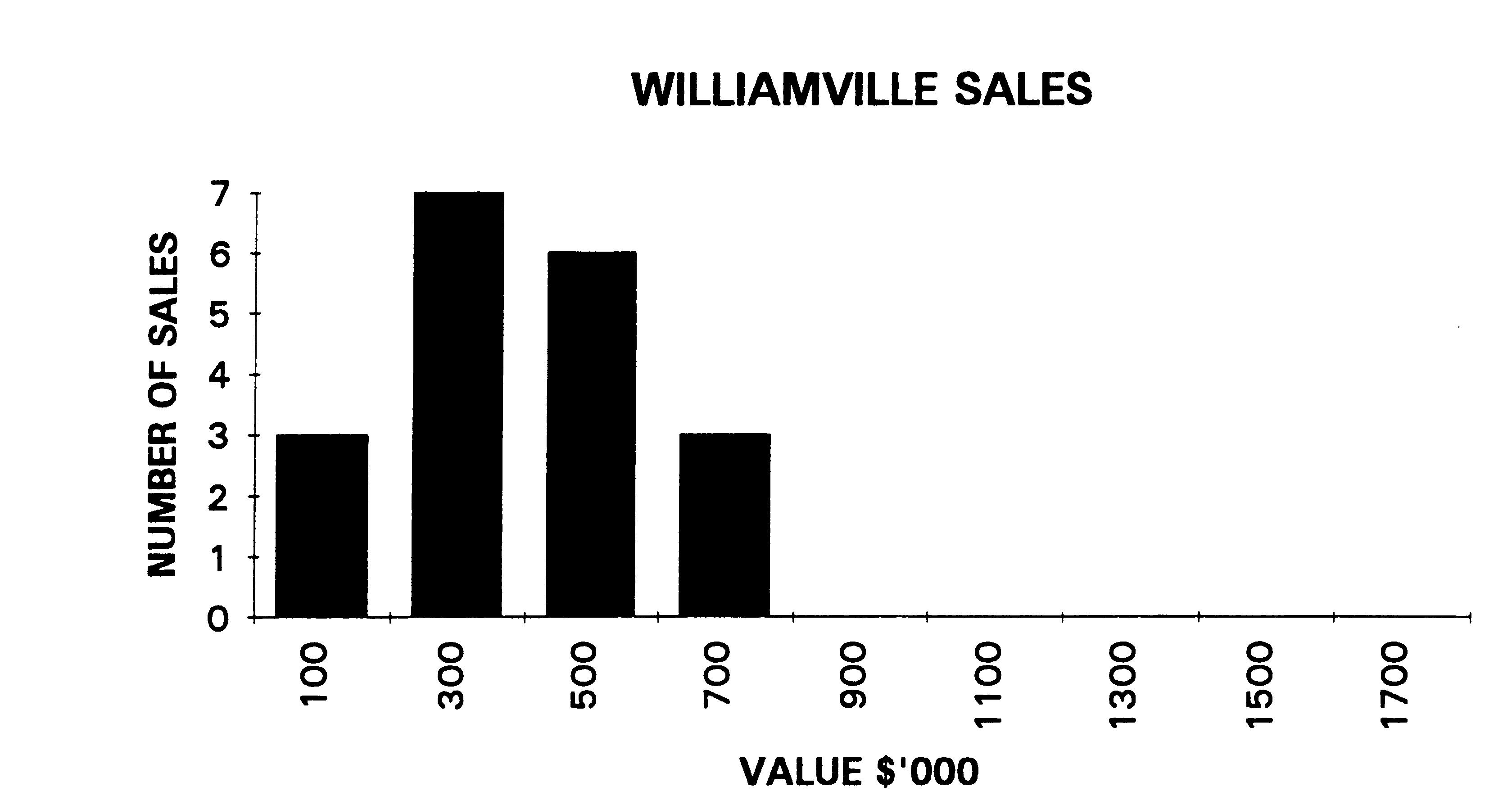
Although Summerton
sales show a similar centre line, the sales for
Williamville are more concentrated around the centre, that is, there is
less spread. Prima facie, the mean value of the sales for
Williamville is more reliable than those for Summerton. However, the
use "stemplots" is a better way to compare two sales data.
See stemplots
DESCRIBING DATA
The above
diagrammatic analysis is very useful and should be an
integral part of the valuation report however, for further analysis,
quantitative measures are required. The most common quantitative
measures are the measures of centrality; MEAN, MEDIAN and MODE.
MEAN (AVG)
The MEAN or average
is the most commonly used measure of valuation
data. However, it can lead to error in valuation analysis as it is
heavily influenced by very high and very low data and in a group of
sales data it is common to have one or two very high sales and/or very
low sales.
MEAN = (SUMX)/n
It is easily found
with the following spreadsheet commands:
Excel: = AVERAGE()
MEDIAN (MD)
The median is
generally, a better measure in valuation analysis as it
is the CENTRAL value in a data group. The central value is found as
follows:
MD = (n+1)/2 Summerton and Williamville
have 19 sales each:
MD = (19+1)/2 = 10
Therefore, the median
sale is that sale at the 10th place.
MODE (MO)
The mode is the most
common value and is not useful with the subject
raw data as there are a number of sales with the same value. However,
it can be used with the histogram as the mode is that frequency class
with the highest column.
MEASURES OF
CENTRALITY FOR SUMMERTON AND WILLIAMVILLE
|
MEAN
|
MEDIAN
|
MODE |
SUMMERTON:
|
589.4
|
450
|
300-500 |
WILLIAMVILLE:
|
465.7
|
450
|
300-500 |
The 3 measures
together provide a good description or analysis of the
sale data. Although the means are substantially different the medians
and modes are the same. Therefore, some other measure of central
tendency would be necessary to further analyse the sets of data.
Although the above measures are useful measures of centrality they do
not measure spread or range. The following useful statistics add a
great deal to the analyses by measuring the spread of the sale data
around the mean.
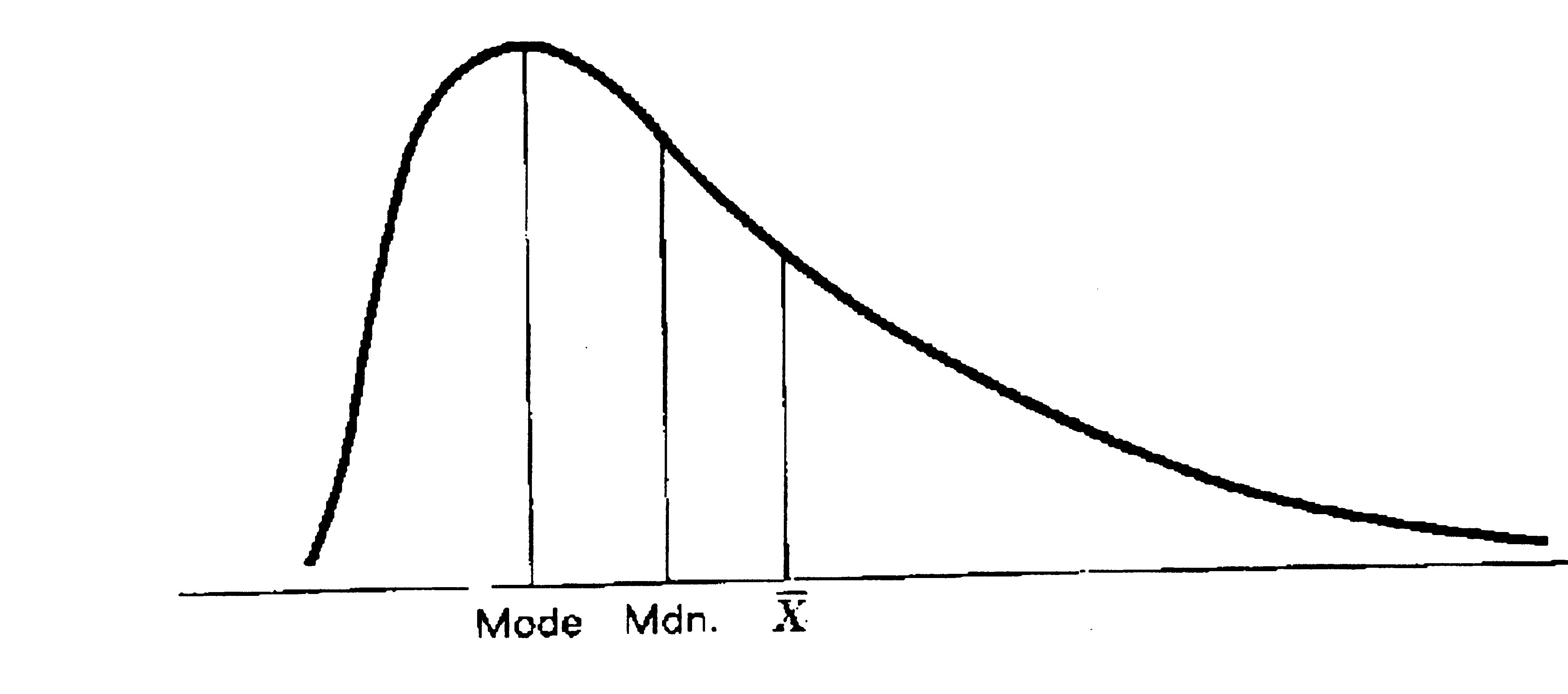
WHEN THE DATA IS
SKEWED, THE 3 MEASURES CANNOT COINCIDE
See quartiles
MAXIMUM AND MINIMUM
VALUES - THE RANGE
Adding MAXIMUM and
MINIMUM values provides a very good picture of the
spread of the data. For unsorted data these values can be readily found
with the following spreadsheet commands:
Excel: = MIN() = MAX()
The range provides a
good measure of spread and the valuer would feel
more confident about using data with a small range than data with a
high range.
RANGE = MAX - MIN
For the sales in
Summerton:
RANGE = 1500 - 250 =
1250(000)
See boxplot
See standard deviation
See
Z scores
7